Every once in a while a product's design and packaging needs to be updated.
I've never quite understood why this is a hard-and-fast rule, but it nevertheless seems to be ingrained in the current business culture. As long as I can remember I've been interested in it though, and the 2009 redesign of the Hema logo stands out in my mind as a clear moment where I became very aware of these changes.
Often the changes are more subtle than such a complete overhaul, and instead of being a total rebranding, the packaging design is just a bit 'freshened up'.
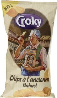
It was then a few years ago that I noticed that a particular style of crisps I enjoy, 'à l'ancienne' from Croky, had its packaging redesigned.
The crisps are thin and very crunchy, which is supposedly reminiscent of the old, handcrafted way of preparing crisps. It is for that reason that for as long as I could remember, the bag featured a drawing of an older spectacled man in a vest with rolled up sleeves. He holds up a single crisp in admiration, while holding a bag of the same crisps to create a Droste effect. This drawing clearly evokes the advertising style of the early 1900's, as well as associations with craftsmanship and pride in one's work.
Regardless of how one may feel about this, it was a marketing strategy that communicated this message of historic craftsmanship unambiguously and effectively.
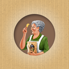
When Croky redesigned their packaging, however, they got rid of the image of this craftsman, instead replacing it with an superficially similar image of an older woman in the same position.
There are a number of things wrong with this design and the first is the name. They changed the name of the crisps from 'a l'ancienne' to 'op grootmoeder's wijze', which translates to 'the way grandma used to make it'. The problem with this should be obvious, as I don't think there is anybody left alive on this planet who remembers fondly how their grandma used to fill the house with the smell of crisps on Sunday mornings. Industrial production of crisps was started in the early 1900's and I think the vast majority of crisps have been industrially produced since. Their convenience is maybe the most appealing quality of the potato chip, and grandma doesn't want to labour for hours to give their grandchildren a similar or even inferior product. Thus the premise of the redesign is nothing but a falsehood.
One can only guess as to what misguided principles led to such a decision, but it was nevertheless further exacerbated by the design itself.
For one thing, the supposed grandma in the image is holding a bag of the crisps she supposedly made herself. As if grandma would package her own crisps in aluminium-lined bags for home consumption. Even if we think that grandma was actually at the helm of a large industrial corporation, it still depicts grandma not as a woman who takes great pride in her craftsmanship, but rather as a calculating businesswoman who sacrificed her home cooking for bigger profits.
Presumably they kept the Droste effect intact in the design for the association it has with advertising of the past, but then it begs the question why they made the drawing itself so clearly digital. It's a poorly made image that looks like some underpaid person slapped together in fifteen minutes on a tablet, which isn't exactly something that would evoke nostalgic feelings in a potential customer. If anything it creates a cognitive dissonance, which is something that should be avoided in marketing at all costs.
Grandma also doesn't hold the crisp to the light to inspect inspect it, like the craftsman did on the old packaging, but rather uncomfortably close to her face, making her appear less like a discerning professional and more like somebody who needs to see an optician for her poor eyesight.
All in all it can thus be said that this redesign wasn't a particularly effective one.
I immediately felt at the time that the company had made a mistake that would limit the appeal of their product. Because I liked the crisps themselves and understood sales might diminish because of this ill-informed decision by the marketing department, I sent them a letter outlining why it this redesign was a terrible idea.
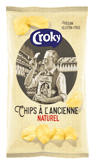
I never received a reply to, or even an acknowledgement of, this letter, but about a year later I did find my favourite crisps again in the supermarket. This time with another redesign that reinstated the original name and a slightly modified version of the original drawing of the craftsman.


