Showing posts with label Observations. Show all posts

Saturday, 28 February 2026

Ab die ecke und schäm dich

It's physically impossible to see all the exhibitions in today's global art world. Therefore much of the goings-on at exhibition venues are photographically documented and distributed on websites like contemporaryartdaily and contemporaryartlibrary.org, which gives people the impression that they have seen all there is to see and are in the know. I've personally disliked the widespread prevalence of this practice for over a decade now, because the installation views used on these websites tend to give an illusion of an overview, the art equivalent of omniscient narrator, where works are depicted in relations that are impossible for any physical visitor to encounter.
In this method it is forgotten, or ignored, that a visitor to an exhibition space is a physical entity, and one that takes the world in with their eyes. Eyes that are different from a camera lens because they have a wide field of view, but a narrow and continuously shifting focus. The body has ears, it has a nose, it has legs that walk and arms that reach. 
And so a picture hung at a height of 110 cm appears completely different from a picture hung at a height of 155 cm. Navigating through a room that is 4 by 5 meters is very different from navigating a room that is 16 by 20 meters. Yet the prevailing standard of documentation has the camera at the height level of the pictures and depicts the room from corner to corner, making such marked differences appear identical.

A recent example of this that I encountered was the show Day for Night by João Maria Gusmão at Sies+Höke. I had seen installation views of the exhibition on the gallery's website, showing the works neatly arranged in a single line and in a clean space, like one is 'supposed' to hang a proper gallery show:

When I visited the exhibition, however, the installation of the works was strikingly peculiar to me, with all the works being hung very low. The top of works were hung slightly below shoulder height for me, being 186 cm tall. I therefore took the following photo with the camera at my eye level:

This snapshot is much closer to the reality of my experience in the exhibition. The works no longer appear as grand statements like in the gallery's documentation, but rather as small and humane hand-made experiments, full of flaws and imperfections.
And this is just one example of when 'good and proper' documentation leads to a distorted view of what the exhibition factually is. Such practices undermine the intellectual honesty of art, and so debase the entirety of art as a noble pursuit.

At the same time, this practice of showing an, at times physically impossible, overview has influenced on how artists and curators alike install their exhibitions. When photographing exhibitions, the camera is often placed in the corners of the room in order to obtain such an overview. Consequently, I've seen many curators, and artists, 'instinctively' walk to the corners of a space while installing exhibitions.
There is little rhyme or reason to this practice, as I've never seen any visitor to any exhibition voluntarily stand in the corner like a punished child, so what the exhibition looks like from that vantage point should be of little concern.

Yet this is a common occurence to the detriment of all exhibition making. I personally encountered a very clear example of this practice in the 2023 exhibition Channeling at the MMK in Frankfurt am Main.
In one room of this exhibition the very wide spacing of the works made no sense to me as a visitor walking inbetween the works. It was then that I realised that the curators must have only considered the show from the corners of the room. I then proceeded to take photographs from all four corners and indeed the placement of the works appeared to make more sense from there.
I later compared these photographs to the official documenation found on the MMK's website and this confirmed my suspicions. In the following images the official documentation is overlaid on my own documenation from two opposite corners of the room:


As you can see, both of the official documentation photographs are simply two narrow views of what can be seen from the corners of the space. The compression that's especially present in the first photograph also shows that their photographs were taken with a short telephoto lens. Thus the experience the curators were apparently aiming towards in the exhibition was for the visitor to stand in the corner of the space and look at the works with a pair of binoculars...
The wall I was leaning against was also empty in a bad way. This can be clearly seen in a photograph taken from where the security guard was standing in the first photograph:


Instead of a short telephoto lens, the official documentation is now all of a sudden shot with a wide angle lens with a larger field of view than the human eye. It's physically impossible to see both works simultaneously like in the MMK's documentation. Their photograph therefore presents a view of the exhibition that no visitor to the space has factually experienced.
But of course, in todays art world the 'proof' of the documentation is more important than any physical reality, so one of the clearly incompetent curators of the exhibition has since moved on to become the chief curator at the MUMOK in Vienna.

I personally believe that documentation of an exhibition should attempt to capture the experience of walking through the exhibition as accurately as possible.
Unfortunately, few institutions attempt to adhere to reality, prefering the polished and standardised appearance that provides them with greater opportunities founded on ever greater falsehoods.

Friday, 12 September 2025

Party Pooper

The above photograph comes from the series 'The Action of Matchmaking Photons in Bars' by Voebe de Gruyter. In a conversation with Maria Barnas, titled 'On Art and Science', she says the following about it:

'The.photos I took in the café are real spots of light. I had stuck reflective tape on the people and the interior and took pictures using the flash. I see the spots of light as proof of light's return.'

The premise here is that light originates from the flash, hits an object and then returns to the camera lens and its sensor, rendering the image. But if we assume that this is the case, as the artist does, then the rest of the photograph, or even any photograph taken with a flash, surely is an equal 'proof of light's return'?

Tuesday, 9 September 2025

Methyl Mercaptan

Artists like to use molecular models for making sculptures. This has already been covered on this blog, but I'd like to expand on the subject a little further in this post.
Molecules have certain stable configurations, which are governed by the distribution of their electrons. This is described by something called valence shell electron pair repulsion theory. It's somewhat complicated, but just imagine that electrons are magnets on a sphere that want to be as close to the centre as possible, while being as far apart from each other as possible. So while atoms are always in motion, this means that on average they are found in only a small number of configurations in molecules:


This kind of spatial configuration is correctly rendered in the large sculpture 'Gas Molecule' commissioned from Marc Ruygrok by the NAM:

This sculpture is supposed to depict methane, or CH4, with a central carbon atom connected to four hydrogen atoms. Ruygrok has largely copied the common 'ball-and-stick' molecular model, only taking some liberty with the colour scheme.
Although molecules don't have a 'real' colour, there is a convention, called Corey-Pauling-Koltun colouring, for using certain colours for certain atoms. The central atom in Ruygrok's model is carbon, which in this convention is always associated with black, while blue is always associated with nitrogen. If the shiny purple-ish hue of the central atom is considered significant, then this is traditionally linked to phosphorous, but is today more commonly associated with potassium.
These colours are nothing but conventions, so it's not that Ruygrok's choice is wrong per se, but it also isn't 'right' to use blue in this case. Without any other information, any chemist will think this model represents ammonium, not the intended methane.

As already stated, this example uses the so-called ball and stick model, but a more realistic space filling model exists where atoms are depicted as overlapping spheres representing their Van der Waals surface. Molecules in this model consist of interconnected spheres, so that a good separation through size and colour becomes even more important than it is in the ball and stick model. With this in mind, let me present to you 'Calcium 4-[4-(2-methylaninlino)-2,4-dioxobutyl]diazenyl-3-nitrobenzenesulfonate (C.I.13940)' by Jean-Luc Moulène:

This is supposedly a model of the molecular structure of a pigment, Yellow 62, which is then painted in the colour of this pigment. I already pointed out that without adequate differentiation through colour, such a model is hardly able to serve its clarifying function.
It is however clear that Moulène didn't correctly render the molecule he meant to render. When I looked up and drew a model of the pigment, I came up with the following structure:

Even without knowing anything about chemistry, it's obvious that these are are two different structures. In the correct model, there are 41 spheres present, while in Moulène's sculpture one only counts 29 spheres. I did notice that in Moulène's sculpture no hydrogen atoms were depicted, which is somewhat common practice. I therefore counted the amount of hydrogen atoms that should be present, of which there are 15, so if the difference came from the absence of hydrogen, then the amount of spheres would be 26. I therefore have no explanation of where the artist went astray in rendering his model, but it is clear that the molecular model doesn't depict the pigment that he claims.


This could also already be gleaned from the inclusion of 'Calcium' in the sculpture's title. Organocalcium compounds are very uncommon and so the inclusion of calcium in the name most likely means that this is a salt. The SO31- sulphonate group in the molecule, shown in yellow with red, is very reactive  and needs to be ionically bonded to a positively charged atom, Ca2+ in this case, to be stable. The double positive charge on the calcium ion is paired with two single negative charges on the other compound, which means that there must be two of the previously shown molecule in the following configuration:

This is of course looks nothing like the molecule in Moulène's sculpture and anybody with knowledge of chemistry could have spotted the error merely from the first word of the title. 

I then noticed the following drawing on the cover of Keith Tyson's publication 'Molecular Compound No 4.':


Comparing this image with the VSEPR models at the beginning of this post, it should be clear that this drawing is not based on any existing molecule. Upon consulting the book, it turned out to contain no further references to reality and consist only of the fantastical imaginings of the artist, so I won't make any further comment on this publication.

I could list more examples of artists that have attempted to employ molecular models, but in short all of these sculptures I've encountered forgone scientific accuracy in some way.
The only one I know of that isn't necessarily wrong was a sculpture that simply used nothing but a commercially available molecular modelling kit. So while this was possibly accurate, it's artistic value was also negligible.


And the reason I've written all this is because I researched the subject while making the following model of a molecule called methyl mercaptan:

Methyl mercaptan, or CH3SH, is one of the molecules that make farts smell. This model is made of a tennis ball, a black golf ball and four small roulette balls. These generic, store bought, balls are both the right colour and approximately the right size for a CPK-model for a molecular structure, as can be seen in this rendering taken from a molecular drawing program:

This is thus an indication that it's possible to have a novel approach to creating a molecular model without necessarily having to significantly compromise its scientific accuracy.

Friday, 29 August 2025

Paper Plane

At Stephan Balkenhol's exhibiton 'Something is Happening' at the Kunsthal, Rotterdam, a sculpture was on show with the straightforward title 'Paper Plane'.
In this sculpture a man is holding a simple paper airplane above his head. This paper airplane has a bit of an unusual, squarish, shape, that's very different from the pointed darts one usually sees paper airplanes depicted like.
The shape of this airplane is however very similar to the design created by aeronautical engineer Ken Blackburn, which earned him the world record for the longest flight time from the 1980's until the early 2000's: 


If we believe that Balkenhol was aware of this airplane design, then the pose of the man in his sculpture becomes interesting. It's a relatively passive pose, vaguely reminiscent of how a child with a kite would stand, holding the thing that is supposed to 'fly' high up in the air. 


Yet part of the reason Blackburn held his record for so long was the combination of his throwing technique with the design of the plane. He threw the plane nearly vertically with a speed of close to 100 km/h to get it as high in the air as possible. From there the plane stabilised and had a slow descend.
This is no mean athletic feat and the intensity of the movement is of course very different from the idle attitude commonly associated with a paper airplane.
 

Friday, 1 August 2025

Philips Sport Vereniging


In 2008 Fred Smeijers and his company Type Tailors redesigned the logo of Dutch electronics brand Philips, as shown above. The differences are small, but impactful, and it was he first time the wordmark of Philips had been reconsidered since 1968.

At the time, the Philips logo was also featured prominently on the shirts of football club PSV, which was founded by Philips in 1913. As such, the company served as PSV's title sponsor from 1982 untill 2016, when under the leadership of CEO Frans van Houten a decision was made to instead promote the company through faulty health devices.

In either case, there was a brief eight year period during which the redesigned logo was featured on the shirts of the football club PSV. Football shirts are a lucurative market and for more than forty years the Philips logo on the front had been an icon for the succesful club.

It is therefore unsurprising to find that even today a number of shirts can be found that sport the Philips logo.
The above two shirts were Adidas-branded reissues of championship winning shirts from the 80's and 90's. Both these shirts were found on secondhand clothing websites, and what's interesting is that the logo used on both of them is the redesigned logo from 2008, as can be most easily recognised by the the slight slant at the end of the 'L'.
This makes me think that these shirts are counterfeit, given that the 'PSV retro shirt 88-89' that is sold directly from the PSV store today uses the old, period-accurate, logo, as can be seen in the bottom left. It seems hard to imagine that a company the size of Adidas would aquire a license to re-release such a shirt and not bother to consult the other major stakeholder about using the right logo.

As an interesting footnote, it must be mentioned that during the last matches that PSV played with Philips as their title sponsor, they used a kit with the first PSV logo and a 'retro' shape. The Philips logo however was the updated wordmark, keeping in line with other Philips branded products.


Sunday, 11 May 2025

On the Scale of Movements

 These are some screengrabs from a video of me doing a skateboard trick I learned recently. It's not a particularly impressive trick, it's just something I hadn't learned in the twenty years prior. When I sent  the video to a friend he said that I was 'making it look easy'.
And the reason he said that was that my arms were very low and close to my body the entire time.
Skateboarding is a perilous activity where you are constantly searching for balance, so mostly you instinctively spread your arms out to find your balance, like a tightrope walker. Yet if you notice my posture, and especially the position of my arms, you'll see my arms are barely raised above my waist the entire time.
I've got a tendency to do things with very restrained movements, and if you think about it for a second, that is exactly what you don't want to do in any activity that involves balance.

 This is a photograph of professional skateboarder Daan van der Linden, and he displays how you do want to position your body while skating. He has his arms wide open and up in the air, with his gaze firmly aimed to where he is going. This is a good and effective mechanism to control your balance.

Yet when I did my skateboard trick, I was effectively walking a tight-rope with the posture of a flaneur. If successful it can be said that this is 'making it look easy', but in reality I have a bit of a reputation of comedically tipping over more often and on simpler tricks than my peers. It can thus be said that generally speaking, skateboarding is an activity that favours large and rapid coordinated movements of the entire body over small inhibited movements of the extremities.

So, you might be wondering, what does this have to do with art?

In art, and particularly in painting, there is also a large difference in those who use restrained movements of wrists and fingers and those who employ larger movements of the arms. Naively this difference can be seen most easily in the existence of large paintings and small paintings.

In much of the common perception, a large painting equals a better painting. Many of the most famous artworks are also among the artists' largest works, like Rembrandt's Nightwatch and Picasso's Guernica. This is probably because art is priced by the meter and thus larger paintings are more expensive. And we all know expensive things are always of higher quality.
Yet in reality I know of very few painters whose work got better when they worked on a large scale.
Although the Nightwatch is Rembrandt's most famous work, it is a fairly unremarkable work in everything but its size.

 If we compare a self-portrait from 1669 with a similarly sized section of the Nightwatch, then the quality difference in the brushstrokes is difficult to ignore.
Large paintings often lack detail and precision, quite simply because it's difficult to perform at a high level for a long amount of time. For example, the average speed of the current world-record for the 100 meter dash is 10,43 m/s, while for the marathon it is 5,84 m/s.
And while stamina is an obvious actor in why large paintings tend to be of lower quality, I also think that a more restrained movement in painting is a very clear indicator of skill. When you think of skilled people, do you see them making large, flailing movements, or do they make small, precise ones? This is also reflected in colloquial uses of 'brute force' versus skill and intelligence.

As I pointed out at the beginning of this post, I'm a person who is very restrained in his movements. I believe this is reflected in the kinds of work I make, but also in the kinds of work I like to see. Much of large scale painting quite frankly has always looked brute and unsophisticated to me and very likely this is because I don't relate, on a personal level, to the the large movements they require. I myself don't move about that way in the world, so it's unappealing to me when other people do.

When I think of other artists whose technical skill I admire, they all seem to work from the fingers, rather than the arm. 

One of the most skilled painters I can think of is Wayne Thibaud. His work is also, usually, relatively small in size. Fortunately there is video footage of him at work available on the internet:


Notice how his brushwork is done with small movements of the wrists and fingers.
Contrast this with David Hockney, who is known for his large paintings. His movements are all from the arm. Even when drawing on a small iPad, he draws by holding his wrist straight and moving his arm.

Although there are minor differences in the methods of each artist, generally speaking movements of the fingers are associated with work on small details. And the work of Vija Celmins is probably as detailed as contemporary painting gets.


I also noticed that Jean-Michel Basquiat mostly paints with his wrist, which is interesting cause he tends to work on a large scale.

There is a quick back and forth movement you can only do with your wrist. To do this precisely with your lower arm, or even your full arm, is close to impossible. And because this style of painting technique magnifies a small movement into a larger one, it requires a lot of precision and muscle control, which isn't easy to imitate. This perhaps helps to explain the distinctiveness of his work, despite his many imitators.

The above footage is of Matt Connors at work. He's an artist with technical knowledge of paint and materials, but it's clear that the brushwork itself is almost unskilled. His brushwork is then done with the entire arm, with the hand itself barely moving. As these are large, relatively uncoordinated movements, anybody can learn how to make brushstrokes like this, which isn't necessarily true for the previously mentioned artists.

It's a shame there is not more material available on the physical movements that happen when artists apply paint. There is limited video footage and I've certainly never encountered any text on the subject. Yet it's the essential aspect where the artist quite literally creates the work.

I'm personally partial to restrained and precise movements, which tends to result in small, detailed work. Yet I'm also aware that as a person I move through the world in a much more minute manner than most. It is thus likely that many people don't relate to my way of doing, and instead prefer the more coarse doings of many others.

Wednesday, 26 March 2025

The Prophecy Has Been Fulfilled

About four years ago I wrote about a number of 'exotic' objects that will likely make their way into an exhibition at some point in the future.
In that list I included the Airblade handdryer that is manufactured by Dyson:

 
And today I saw pictures of a 2025 exhibition by Richard Sides:


Saturday, 8 March 2025

The Museum is Multiple

At the end of 2024 the Van Abbemuseum published the book 'The Museum is Multiple' as 'at once a case study of Charles Esche's directorship from 2004–24 and a richly illustrated archive of the period'.
I have some gripes with the book, stemming mostly from the book's lack of a broader perspective.
Esche himself reiterates in his introduction that the book was conceived as 'more of a critical case-study than a celebration or documentation of what was done' and while the book is a case-study of some kind, it can't be said that it's a critical one and at times reads more like a manifesto for the future.

It's impossible for me to discuss every single thing in need of nuance in the book, but I'd nevertheless wish to point out some recurring notions that I found disagreeable.

Firstly, there is a strong prejudice against the perceived provincialism of the museum, which seems to stem from Esche's well-publicised dissatisfaction with local politics. As he writes in the beginning of his introduction: 'In 1936, the Van Abbemuseum was a late entry to this world of museums, just as Eindhoven itself was late to industrialise, but it inevitably inherited the traditions that European museums had already acquired.' Which is kind of a peculiar statement. The deriding tone is obvious, but his view of the situation isn't related to the facts he presents.
It is made out by Esche that the Van Abbemuseum was a tardy and derivative entry to the world of museums, as exemplified by its founding in 1936. Yet if we actually look at some historic data, 1936 is not that late for an entry to the realm of modern art museums and was in fact rather typical and timely.
The National Gallery of Art in Washington D.C. was founded in 1937, and the Musée National d'Art Moderne in Paris, now the Centre Pompidou, was only founded in 1947. The MoMA in New York was founded in 1929, but didn't have its own permanent building until 1939, three years after the Van Abbemuseum. Yet it is this MoMA that is seen as the drive behind a codified idea of modern art, as Esche writes: '[...] in the post-1945 period as the early artistic avant-garde began to be canonised and the concept of systematic and separate development of modern art spread from the Museum of Modern Art in New York to the new outposts of US-shaped international art in Western Europe.' This is an overly simplistic view that, when written like this, is demonstrably false.
The original impulse for the MoMA came from a trip Alfred Barr took to Europe, where he was inspired by the Dutch museum culture, writing in a letter that 'nothing similar to Holland is possible at present in American museums' and 'to Americans, the success with which this policy of showing contemporary advanced work [in Dutch museums] has been carried out is a sad reminder, and perhaps a challenge.' The initial framework of the MoMA was thus based on Dutch museum policy, which according to Esche it would later help shape. I know the art world loves circular reasoning, but to present history in this way is just a gross misunderstanding of a factually complex interplay of various actors in and out of the artworld whose interests have shaped this quote-unquote canon.
Because those actors are always in motion, this canon, if it exists at all, is at best fluid and open to interpretation, yet the museum sees it as a singular static narrative. Christiane Berndes says: 'The museum was a museum: a white cube that represented the canon, or tried to represent the Western canon of modern art.' This idea of the canon is elaborated further by Annie Fletcher: 'I remember when I first came to the Netherlands, it felt like all European museums had an Anselm Kiefer, a Georg Baselitz, a Donald Judd. Modern museums seemed interchangeable.' From this we can glean that in their idea the 'canon' basically consists of the common denominators that can be found in the collections of 'modern museums', whatever those may be.
Yet one of the ways they attempt to remedy this problem of the canon is to introduce new people into the museum and their collection. When Esche is asked why Lily van der Stokker was invited to curate a series of exhibitions and acquisitions, he replied that 'she wasn't one of the Dutch artists that had been in the canon here, in the museum'. The simple fact is ignored that this was also true at one point for Kiefer, Baselitz and Judd. In fact, the Van Abbemuseum was the first European museum to host a solo exhibition of Judd's work in 1970. The more pertinent question of a museum's agency in shaping this canon is therefore simply glossed over.
Another 'solution' to this problem of the canon is L'Internationale, a collaboration between museums that 'believes in being locally situated'. One of the first projects was an exhibition called Spirits of Internationalism, where these museums showed each other’s collections. As Annie Fletcher says: 'Spirits of Internationalism was a much more nuanced exploration of the location and context of each of these museums and showed how artistic movements and artist relate. The dialogue between collections becomes much more explicit, richer and complex. That's exactly the quality of it that's fantastic. On that level you break open the canon again in much more fruitful ways.'
Let's keep this interpretation in mind when we read what Leo Castelli wrote about the MoMA in 1941: 'Alfred Barr was presenting an encyclopaedia of European art, such as no European museum could have offered at the time. Side by side, you could find French Surrealists, German Expressionists, and Russian Futurists. Along with the huge collection of French Impressionists, unlike in France, you also found artists from other countries, completely unknown in France, whose works had originated many later developments. The museum was organized so carefully that you could trace the history of all those aesthetic movements, through an analysis that was not at all the European style.'
It can therefore be said that the museum in their 'new' project is very much doing a similar thing the MoMA was attempting in the 1940's. The staff of the Van Abbemuseum is thus reacting to a system where Europe mimicked New York who mimicked Europe and is this mimicking is somehow seen as provincial. So, to remedy this system they reinstate the European provincialism that New York sought to remedy and then remedy it themselves by introducing a wholistic viewpoint, which is what they wanted to get rid of in the first place.
It's pure hallucinatory madness masquerading as a solid foundation for the museum's policy.

If looked at as an archival document, it is also clear that the book seemingly ignores the times the museum specifically engages with this 'canon' they seek to reject. As any other museum, the Van Abbemuseum hosted a number of solo exhibitions in the period between 2004–2024. In the short introduction to this section, they themselves write that 'the artists selected were new to the museum and often from other geographies and traditions than those of the United States and northwest Europe, geographies that had been at the centre of the Van Abbemuseum's programme in the twentieth century' and then present a selection of exhibitions that seemingly adhere to these criteria.
Absent from this selection, and thus from the book as a whole, are the exhibitions of Lee Lozano, Jo Baer, Lynda Benglis, Allan Kaprow, Mark Lewis, Piero Gilardi, Jutta Koether, Mladen Stilinović, Aernout Mik, David Claerbout and Hito Steyrl, who all firmly fit into the idea of the canon of Western art, if one goes by the number of museums that have collected their work. Leaving these out is a clear attempt at whitewashing the museum's history so that the presently preferred narrative isn't stained.
Yet it isn't even true that the seventeen solo exhibitions that are presented in the book are 'often from other traditions than had been at the centre of the Van Abbemuseum's programme'.
Seven of the seventeen presented artists are alumni of the Rijksakademie, an institute that is probably the most enduring and most hollow highbrow tradition of the Dutch art world. There is nothing inherently wrong with showing Rijksakademie alumni, but to pretend they are from 'traditions other than those of northwest Europe' is just a blatant lie, regardless of where those artists grew up.
A further three artists mentioned in the catalogue; stanley brouwn, René Daniëls and Ilya Kabakov, are likewise firmly embedded in the 'canon', so that more than half of the already cherry-picked exhibitions don't adhere to the claims the museum makes.
Rather than engaging critically with an exhibition history and explaining, or possibly reconsidering, the validity of their choices, they incomprehensibly made a decision to just leave out a whole bunch of information that is ostensibly detrimental to their present opinions. No history is every fully complete and unbiased, but to simply disregard a whole chunk that doesn't fit your present-day viewpoints is about as far removed from critical thinking as one can get.

In general, it can be said that an inability or unwillingness to look beyond one's own immediate surroundings is oddly present throughout the book.

An important theme for the museum's future is an idea of the 'life cycle of works' in the collection. Within this discussion the problem of endlessly taking care of physical works is brought forward. Which is certainly a valid and non-trivial subject for a museum to think about.
Yet the discussion largely revolves around the physical conservation of older works: '[...] we've started to talk about a death and life cycle of works to trouble this idea of caring for and maintaining works in one state for eternity. What if we acknowledge what you, Christiane, pointed to – like the material degradation of works – and build that into how we can care for works with time limits?' These questions are reasonable, yet these questions are also ultimately ones not of time, but rather of shifting uses, resources, and perspectives. For example, I don't think anybody would question that the Sphinx is worth preserving, despite its battered appearance and old age.
However, the question doesn't seem to be approached through these more fundamental aspects.
During Esche's directorship the museum has acquired dubious legal constructions and installations that respond to a specific event in national politics, where the enduring continuance was doubtful even at the time of acquisition. It is not these works that come up in their discussions of a 'lifecycle of works', but rather some generic paintings from the museums' early history. And if you're approaching these questions with that mindset of a linear timeline, you very quickly find yourself on slippery terrain.
This is perhaps best exemplified by an anecdote in the book where the loan of a Picasso painting to a museum in Palestine was discussed, as the safety of the painting was difficult to guarantee. Esche quotes Christiane Berndes in saying to him that 'this is the Picasso. We have a responsibility to the people in Eindhoven or to the city council.' To which Esche's reaction at the time was that 'if I focus on that responsibility, I'm never going to be able to do anything'. Although he says that now he recognises Christiane's viewpoint 'was a sound one', it still is exemplary of how a curatorial team can be misguided in how the ownership of, and responsibilities towards, a collection funded with public funds is organised and accounted for.
While Charles Esche seems to have matured through his more nuanced standpoint towards these matters, young curator Yolande Zola Zoli van der Heide still expresses in the same interview that: 'if more people are involved from the get-go, the process is more sluggish. If one person says, 'We're going left', it's easier and the rest should follow. [...] I do envy brute force, being able to move instead of convincing and waiting for people to catch up to your idea, whether it's right or wrong.' And although she underlines the 'patriarchal' aspects of that kind of brute force decision making, it's nevertheless something she in some way aspires to, even while she recognises that this is exactly what caused the perceived shortcomings of the museum that they are now trying to amend.

This attitude is typical throughout the book, where contradictory viewpoints are glossed over and explained away as irrelevant and unimportant. Nowhere is this clearer than in a statement by Steven ten Theije towards the end of the book. Obviously irked by the lack of 'greater support within the city council or in the city' towards the museum's policies of 'socially engaged art', he writes: '[...] it became all the more clear that our role as an international pioneer did not match the perception of local users. After all, they should be inspired by engaged art par excellence. We ourselves could recognise the emancipatory power of art a la Rancière, but it would be nice if our audience would do the same a little more often.'
This is a baffling bit of self-delusion where the broader audience gets blamed for not realising that the museum's staff is apparently very effectively socially engaging them with art. This completely ignores the, much more likely, possibility that you're doing something fundamentally wrong if those people you're trying to engage aren't engaged with what you're saying. In the museum's opinion it is the audience who is stupid for not 'recognising the emancipatory power of art a la Rancière', not the museum for its inability to perform its core responsibility of engaging with the public.

As can be read on the back cover, the book has a strong focus on decolonisation through an overwrought equation with modernism. Yet as the above quote shows, the key attitude throughout the book is that the museum's vision is right and justified, and therefore it has a moral obligation to impose that vision on any and all people. And more importantly, anybody who disagrees with this viewpoint is a lesser being and may be disregarded.
Now, it might just be me, but this, rather than any specifics of modernism, is exactly what a colonialist attitude entails. In fact, Charles Esche agrees with me: 'In demodern terms, the canon now appears as another singularity of the kind that modernity as an ideology is always trying to impose on everyone | the idea there is the one and only way, or that there is no alternative or that everything else is primitive, traditional and will die out – whether that's people or ideas.'

Throughout the book their own singular vision of western modernity is replaced with an equally singular naïve idea of plurality as the inverse shape of this modernity, where the framework of the museum is employed as a mechanism for its validation. As that framework is largely constructed on the vision of western modernity they are attempting to subvert, this is of course an unattainable position.
It is perfectly valid to question the 'established canon' of (western) art, but if you're going to judge an outcome of a set of circumstances without a firm grasp on the mechanisms through which those circumstances led to that outcome, you're bound to repeat the same mistakes over and over again.
This book claims to be a 'critical case study', yet the absence of contrasting viewpoints and incompleteness of its archival aspects, only make it a document that is highly opinionated and at times hypocritical in its standpoints.
I therefore would like to end this short and incomplete consideration with an anecdote I found in the book about Diana Franssen, a curator who worked for 31 years at the museum and who is otherwise conspicuously absent from the book. She is described as 'working through the archive of the museum' and 'very interested in this critical reading of the archive'. It then says:
'What she learned is that reality was much more complex and much more nuanced. She kind of confronted Charles with it, saying, 'You're not telling the whole truth.'


Thursday, 21 November 2024

There are no good curators.

A friend asked me about my opinion on who I thought was a good curator and I told her I don't know any good curators.  She looked at me incrediously and while I was trying to explain what I meant, I realised that the job of a curator has very little to do with artistic qualities. Which is of course not how we think of curators today.

The kind of curator she was thinking of makes some kind of artistic decisions and tends to present these to a public through exhibitions and the like. In this sense there have been curatiorial efforts that I admire, but these tend to be by artists, like Robert Gober's presentation of the Menil collection, Simon Starling's show for the 50th anniversary of the Camden Arts Centre, or gerlach en koop working with the collection of the Bonnefanten Museum in their show : . What these exhibitions have in common is that they had a clearly defined existing collection as their subject. It was a quote-unquote straightforward question of which objects to choose and of how, and why, to combine and display them. Each of them made interesting and unusual choices in these matters and that makes those shows memorable for me.

But this is not really what a curator does. A curator generally doesn't make decisions about a static collection of objects. Instead, a curator works with artists or other institutions and collectors, where various matters have to be balanced, discussed and negotiated. This kind of work makes up the bulk of a curator's duties and is managerial and logistical in nature. Only loosely is it connected to any kind of artistic decision. This makes it so that the artistic vision of such a curator is essentially limited to a question of taste or of who they are able to contact. There are some curators whose taste in artists overlap with mine, but that doesn't necessarily mean I will relate to the exhibitions they create, because it is extremely rare that all decisions in an exhibition are based on the personal preferences of a single person.

Any curator working at an institution is going to have to balance various interests of various stakeholders, be it artists, lenders, various kinds of audiences, governments, financial backers, and so on. Their job is not to make 'a good exhibition', their job is to weigh and manage the importance of many different demands. Demands that are quite often in conflict with each other.
There is theoretically a bit more freedom for a curator at a private gallery, but even there the artist, not the curator, usually has final say about the artistic aspects of their exhibition. A privately funded gallery also can't forget about the taste of the public if it has to make sales in order to survive.

Anything can only be judged on their own quality, so if there is such a thing as a good curator, it would need to be a wholly independent person, with enough affluence to build a collection from which they can freely choose and arrange that collection as they please. 
Perhaps more importantly, a good curator would need the vision and the foresight to build that collection in a way that it allows for many different cross-links between objects, so that this collection can offer more than the simple sum of its parts.
I for one can't think of any person, or collection, that fits this description and therefore there are no good curators.

Tuesday, 7 May 2024

Please (don't) take a seat

 At the recent solo-exhibition of Sung Hwan Kim at the van Abbe Museum I encountered the following set up:

In case my low-quality phone photograph isn't clear enough, what we have here are two rectangular black objects made of wood. They are of near-identical height and placed on the floor about 1,5 meters in front of a screen that is showing a video.
What is strange about this is that one is marked 'Please take a seat', while on the other it's written to 'Please don't sit'. The first is meant as a bench to sit on and watch a video, the second is a box that houses a projector.
To include two almost identical objects with opposite functions is such an absurdly stupid decision that it could have easily been the premise for a Monthy Phython sketch.

Friday, 26 April 2024

The Difficulty of Forgetting

A few months after my grandmother died, there were a few of her belongings left at my parents' house, including a simple painting of a farm. 'We tried to see if it was worth something', my dad said. 'And it was about sixty euro's', I immediately replied. 'Yeah! Yeah, it was!', he said, surprised, as if he had no idea how I spent my time in the preceding fifteen years. He naturally was also a little bit disappointed with the painting's value. It had hung so long in my grandmother's house that the whole family probably thought it was very valuable.
In either case, I don't know where that painting is currently. Perhaps in my parents' attic, or at an uncle's house. I can't even rule out the possibility it was simply thrown away.

My point is that whenever I see the claim that an artist was 'rediscovered', they were never forgotten or unrecognised in the first place. It takes a substantial amount of attention, effort, space and other resources to preserve any kind of artwork for more than a few months, let alone decades or centuries. So whenever I see more than a single work turn up by a 'forgotten' artist, you just know that that's a false claim. Somebody somewhere cared very deeply about those works and went to great lengths to safeguard them.
If you have even a handful of people actively safeguarding your work while you're still alive, then you're a very, very, lucky person. And if this is still true when you're dead then you're even luckier.

Tuesday, 16 January 2024

The Artist's Artist's Critic's Critic

During 2023 I recorded most of my visits to exhibitions on a website called The Artist's Artist's Critic's Critic. On this website I scored each exhibition one to five stars on six characteristics: difficulty, entertainment, originality, legibility, consistency and craftsmanship. I also recorded the time spent at the exhibition as an indication of my affinity with the work.
Part of the reason I started this undertaking was to see if I could develop an alternative to the subjective and nonsensical star rating system that's used by various media outlets. By trying to formulate those aspects of an exhibition I adhere importance to, I thought it might be possible to provide some insight into my own viewing behaviour, while still having a numerical ranking system.

Now the year is over I have crunched some of the numbers and it gave some interesting results.

In 2023 I recorded 79 exhibitions. 65 of those were solo shows, of which 31 were at museums, 21 at galleries and 13 at other institutions. Of the 14 group exhibitions I recorded, 7 were at museums and 7 took place at other institutions. I visited no group shows at commercial galleries.

When rating something 1 to 5 stars on six different characteristics, the range of the total scores lies between 6 and 30, with an average of 18. This equates to a 3-star score on all six characteristics.
The average total score I've given to those 79 exhibitions is 18,25, with a median of 18 and modes of 12 and 22. This was surprising to me, to find that I ended up with the factual average as my personal average. That does mean there was some degree of consistency to my judgements, which could be interpreted as a degree of objectivity.

In terms of average score per characteristic, difficulty had the lowest with 2,6; then entertainment with 2,7; originality with 2,9; craftsmanship with 3,3; consistency with 3,4; and legibility with 3,5. Although all scores only deviate from the theoretical average of 3 with maximum 0,5 points, it was surprising to find that legibility scored slightly higher overall. Part of the reason I included legibility as a characteristic was to measure the degree in which the exhibition requires explanation beyond the works themselves. It's good to see I rated only 15 of 79 exhibitions with one or two stars on this point, as I definitely think this is a problem within art in general. But I guess by measuring I found that it's not as big a problem as I thought it was.
That difficulty is the lowest scoring metric doesn't surprise me however. I defined difficulty as the ability of the exhibition to make think and challenge me intellectually, and while I enjoy many exhibitions, these days its rare that they show me something I can't make sense of. In fact, only one exhibition scored five stars on this subject, which was Philip Metten's solo exhibition at Zeno-X gallery in Antwerp.

Broadly speaking, I rated solo shows at galleries the highest, with an average score of 20. Solo shows at institutions received an average score of 19 and solo shows at museums received the true average of 18. Group shows at institutions scored a slightly below average score of 17, but group exhibitions at museums on average scored a mere 14. This is also the biggest deviation from the norm with 4 points. These low scores for group exhibitions reflect my overall impression that curators aren't very good at making exhibitions and that this is especially true for curators working at museums. In fact, the only group show that scored above average was The insincere charm of things at the Balcony in the Hague.

Some interesting low scores came from shows by Anne Imhof, Jenny Holzer, Simon Denny, Kasper Bosmans, Helen Frankenthaler, Ragnar Kjartansson, and Elmgreen & Dragset. These are all normally considered highly rated artists, if not globally then at least in their respective countries of origin. Yet the shows I saw of them in 2023 apparently weren't exactly up to snuff.
I personally found it interesting that Daan van Golden at Micheline Swaczjer had a below average score as well. That just wasn't a very interesting show with works from an artist I otherwise greatly appreciate.

Of course I also have a top five of shows that I've recorded in the past year.
My top show, with a score of 28, was Tomma Abts at galerie Buchholz in Cologne, followed by Thomas Schütte at De Pont in Tilburg. The latter got there purely on the quality of the works themselves, as the curatorial effort was average at best. Third was Jeff Weber's Image Storage Containers at the CNA in Dudelange. I doubt many people have seen that exhibition, but it was very well put together on all fronts and punching well above its weight.
Fourth and fifth place are actually by the same artist, namely Aglaia Konrad at the FOMU in Antwerp and then later in the year also at Mu.Zee in Ostend. Once again just excellently put together shows that merely faltered a little bit on the entertainment factor.

Only one show actually got the average score of all 3-stars and this was Blank. Raw. Illegible..., curated by Moritz Kung at the Leopold Hoesch Museum. It was a comprehensive group show of 'empty' books and about as average as an exhibition can be. The presentation was adequate enough to be unnoticeable, simply unremarkable in every way possible. For an audience it's often hard to understand books when displayed in glass vitrines, but each book was carefully considered and shown in such a way to be as accessible as it could possibly be. The books on display presented a very broad, thoroughly researched overview and thus for every uninteresting work in the exhibition there was also a gem that got you excited. And as unusual the premise of the exhibition was, it was simultaneously also somewhat obvious. If you want to have a yardstick for what a neutral and average exhibition looks like, that is it. It was spectacular how unspectacular it was.

As a final remark I only found a very weak correlation of 0,28 between time spent in the exhibition and the overall score. The bulk of this number comes from the correlation between the scores for entertainment and for difficulty, with a correlation to time spent of respectively 0,40 and 0,32. All other metrics had a correlation of 0,18 or less. So if you make me laugh or think, I'm going to spend (slightly) more time at your exhibition. 

Keeping track of the exhibitions I've visited like this has been an interesting experiment. I would also say that I've mostly succeeded in my attempt to rate the exhibitions as objectively as possible on each of the six characteristics. When all the scores are added up, each exhibition is found in the quartile that corresponds to my more intuitive and 'unfiltered' opinion of that exhibition. I'm not sure if I will continue to keep track of the exhibitions I will visit in the future, but it's been personally interesting to systematically record one's thoughts and I believe it has given some indication that a more objective rating system for exhibitions is possible by using different metrics than those that are commonly used.

Saturday, 2 December 2023

Kasplantje


Pizza Gallery, Antwerp


Heuvel Galerie, Eindhoven

Sunday, 26 November 2023

Principal Understanding

In the past I've already spoken about how much of the Jan Van Eyck Academy's 'Future Materials Bank' programme is somewhat misguided.

In that post I didn't point fingers at individual contributors, because I do believe the general aim of the Future Materials Bank is a positive one and I don't like to deride people who make honest mistakes.

That being said, I recently visited their website again and one of their featured recent additions was listed as 'Phenol, Sodium Ascorbate'.

This caught my eye, as phenol is extremely toxic and definitely not safe for use outside a laboratory. Naturally it occurred to me that this is in stark contrast with the aims of the Future Materials Bank.
The accompanying article is confusingly written and contains a number of errors, so I was surprised to learn at the end of it that its author, Giulia Principe, was a 'tech fellow' at the Rijksakademie in 2022. The tech fellow programme was instituted that same year and gives a small number of 'artists with advanced knowledge of materials and/or techniques' the possibility 'to become a technical specialist. [...] In addition, the tech fellow conducts research into materials or technology in the workshop(s), and makes a report'. The year-long fellowships are supported with a budget of €22.000 for each of the fellows.

The article at the Future Materials Bank seems to be derived from Principe's research results of this fellowship as published on the website of the Rijksakademie. That text is somewhat easier to read, yet contains the same errors, so I will base my criticism here on that short paper.

Principe's 'research' was concerned with finding more environmentally friendly solutions to photographic film development. The main body of the text is thus split in four parts: Developer, Stop, Fixer and Waste Management.
The first sentence of the developer section already is a good indication of things to come: 'All film developers are made from phenols, a molecule that consists of a phenyl group bonded to a hydroxyl group.' None of this is strictly speaking true. Most commercial film developers are in fact made from phenols, but this is because phenols are good reducing agents for silver halides. In theory any reducing agent can work as a film developer, so even something like iron(II) can be, and has been, used as such. The second part of the sentence confuses the nomenclature, as phenols are benzene rings with one or more hydroxyl substitutes. When a benzene ring is itself a substituent on another molecule, then it's called phenyl-. This confusion of nomenclature also helps explains the strange indication of 'phenol' as a 'future material', as phenols, multiple, are a class of molecules that can have many different properties. Some of those molecules are helpful and essential to complex life, while others, like simple phenol, are dangerous and toxic.
The rest of the section is full of these kind of statements that miss the mark and they do nothing but show Principe's own lack of understanding of the things she is professing.
The main 'result' of her 'research' is that you can use ascorbic acid as a film developer. This has been known, as Principe herself asserts, since at least the 1930's, so this is hardly news. A clear understanding of what makes a good reducing agent might have lead her to some other possibilities of compounds that could act as successful film developers, but no explanation is given by her as to why ascorbic acid works well as a film developer. Neither is there an outline of what kind of properties a good film developer should have. The only theoretical background she presents is a screenshot of another paper, that shows an image of two isomers of ascorbic acid. She doesn't provide any form of citation or context for this paper. The screenshot does include some clarifying text by its authors, however this is cut-off mid sentence when it gets to the clarifying part.
Directly after Principe merely repeats that 'the addition of sodium carbonate is necessary to render the ascorbic acid solution alkaline in order for it to work properly' and no explanation is given why this is would be so. No proportions are given by which these two should be mixed, not a single bit of elucidation is presented in these 'research results' as to why or even how one could use ascorbic acid to develop film. Nor is there so much as a broad outline of what is happening when film is exposed and developed.
For the record, developing film means that an electron is added to (a cluster of) silver ions, which then become permanent and visible silver metals. All film developers are thus molecules that are able to donate electrons which selectively reduce the exposed Ag+ to Ag0. Film developers are thus all reducing agents, with some other characteristics, like being soluble in water. Ascorbic acid is a particularly good reducing agent because of the resonance with the double bond next to the hydroxyl group, which partially stabilises the negative charge in the ascorbate ion. Phenolic compounds are even better reducing agents for this purpose because the conjugated pi-orbitals in the aromatic ring have even greater resonance stabilisation. This reaction needs to happen in basic conditions because the ascorbic acid will remain neutrally charged unless it's deprotonated. All of this is still a somewhat clunky explanation that requires more elaboration to most readers, but at the very least it gives some indication of what is happening and why.
In her project Principe also attempted to combine the ascorbic acid with extracts from plants, as in her words 'any source from the fungi or plant kingdom will add something to the developer'. Again no theoretical explanation or reasoning is given and the whole section is pretty difficult to follow. It can however be gleaned that she is somehow searching for phenolic compounds from 'natural' sources. 'After testing several phenolic sources, I found a successful combination of sodium ascorbate and phenols extracted from blueberries. It works perfectly and just as fast as a regular developer with both film and paper.' This extraction from the blueberries apparently happened through simple macerating and boiling. I found it bold, if not brazen, to claim that it's specifically the phenolic contents of blueberries that are extracted and contributing to this reaction. As we have already seen, any reducing agent is a possible film developer. Most acids are reducing agents, some sugars as well, and berries are full of those. Proper extraction and characterisation of wanted analytes is its own field of study, so to claim that you isolated a certain mildly water-soluble group of compounds by nothing but some soaking is questionable at best. Principe's own adventure into this complex field is when she realised that 'the extraction process can involve ethanol depending on the polarity of the source'. I'm not exactly sure what 'the polarity of the source' is supposed to mean in this specific context, but her next assertion that 'certain natural phenols have different polarities and they can be extracted by solvent with opposite polarity', is unfortunately false. All phenols are somewhat polar due to the high electronegativity of the oxygen atom, so the use of 'certain natural phenols' here is a clear safeguard against strong claims which might be wrong. As for the second part of the sentence, solvents tend to dissolve molecules of similar polarity, not the opposite. A clear example is the inability to mix water and oil, as water is a very polar substance, and oil an a-polar substance.
The developer section of the text ends abruptly, with no real conclusion other than the previously cited unbased assertion that 'it works perfectly and just as fast'.
Even the most elementary lab reports contains some theoretical background on the performed experiment, together with a detailed, and preferably reworkable, description of the experimental method(s) used, the raw results of those experiments and a discussion of those results. All of this is referenced with a bibliography of cited sources. This quote-unquote report contains none of these.
But we are only halfway through the text, so maybe it will get better.

The next section, stop, is very short. There is some talk about how even though it isn't considered harmful it should still be replaced, as 'waste may have to be pre-treated before discharge and should not be discharged to the septic system.' The manufacturer likely included this message because they know their product will be used to wash away other chemicals, but they don't know which chemicals, in what manner, or in what quantity. Very likely harmful candidates are bromide salts originating from the silver bromide in the film and perhaps the aforementioned harmful phenols. Thus replacing the stop doesn't necessarily change anything about its environmental effects.
Nevertheless, according to Principe, 'replacing the stop was easy, since the solution should be simply acidic in order to work.' Finally we have found something that is unequivocally true in this text, but unfortunately she offers no explanation as to why it is true. As we have already seen before, the stop  introduces a (weak) acid to the development solution in order to (re)protonate the ascorbate, at which point it is no longer active as a reducing agent. It can then simply be washed away.

The next chapter, fixer, is then regrettably one big pile of misinformation.
The main assertion of the section is that 'a low-toxicity photographic fixer can be made from just salt and water'. This is just not true and we will discuss why in a second. First it must be addressed that the most common fixer is ammonium thiosulphate, which, as Principe says 'is not classified as environmentally hazardous. However,' she continues, 'it is classified as a Hazardous Decomposition Product: heating to dryness will cause production of ammonia, oxides of sulfur, ammonium sulfate and sulfur.' The key phrase there is 'heating to dryness'. If your aqueous solution of ammonium thiosulphate is boiled until all water has been evaporated and only some hot powder is left, then, and only then, will such decomposition occur. As commercial photographic fixer is used in water at room temperature, such a decomposition event will never ever happen. There thus is no danger in using ammonium thiosulphate.

Yet according to Principe it is still necessary to replace this fixer and her preferred replacement is salt, or sodium chloride. Sodium chloride is itself an ionic bond of Na+ and Cl-. The reaction that thus supposedly occurs with silver bromide should be AgBr (s) + NaCl (aq) → AgCl (aq) + NaBr (aq). A very clear indication that this cannot and will not happen is that AgCl, or silver chloride, is itself insoluble in water and that NaCl is in fact often used to precipitate Ag[NO3] out of solution.
But perhaps we're wrong in this straightforward assertion of knowledge that can be found in the solubility charts taught in high school chemistry.
In Principe's description, 'at least 40% of the solution should be salt' and it will take '24 to 48 hours to clear the film'. The extremely high concentration of NaCl and the long reaction time should also be indications that using table salt might not be a solution to the problem.
Principe claims that 'the water should be saturated with salt'. As the definition of saturation is the maximum amount of a substance that can be dissolved in another, it should be obvious that saturating a solution with one substance is always counterproductive if the goal is to get another substance into that solution.
For a more mathematical example as to how ridiculous this proposition is, let's remember that the proposed reaction has a stoichiometric ratio of 1:1, where one molecule of AgBr reacts with one molecule of NaCl. AgBr weighs about 3,2 times as much per mole than NaCl does, so with one gram of NaCl, you can theoretically dissolve 3,2 grams of AgBr. In a picture of the process, some film strips are sitting in about 250 mL of water. If 40% of the solution, by weight I assume, is NaCl, then that 250 mL of water contains 100 grams of salt. That 100 grams of salt, if Principe's assertions were somehow true, could then theoretically react with about 320 grams of silver bromide. For some reason I doubt that a little five centimetre strip of photographic film contains 320 grams of silver bromide.
But, you might say, it has already been said that the reaction is slow, so that's why you need so much salt. This ignores the fact that the reaction can only happen at the surface of the film strip, so all those other molecules that aren't present at that surface don't contribute to the reaction. Hence the need for agitation in any of the steps in film development.
In an attempt to speed up the reaction, Principe also considers the temperature. She quotes the Arrhenius equation, which broadly says that for a 10 ºK increase in temperature, the reaction rate roughly doubles. This has mostly to do with activation energy, or the amount of energy needed to start a reaction, which is not necessarily relevant here. In her text she somehow gets to a very specific increase of the rate of 2,7 times at 30 ºC. She thus obviously attempted to calculate something, although its not clear to me what exactly that could be. As we have already seen that in the salt solution there is barely any reaction happening at all, a far simpler explanation is that solubility tends to increase with higher temperatures. You can see this when you add sugar to warm tea and it readily dissolves, but then when the tea cools down, most of this sugar will become a sticky lump at the bottom.
Clearly there are problems with the feasibility of Principe's proposed reaction, that's why 'thanks to the Rijksakademie resources, I was able to work with a chemist over the summer to find a sustainable way to increase the velocity of the fixer'. I'm not sure what the background of this supposed chemist was, or what instructions they were given, but despite them not convincing Principe in the errors of her ways, they nevertheless gave some possible solutions that may have some impact in getting the AgBr to dissolve.
The simplest of these was the addition of methylsulfonylmethane (MSM). Once again Principe gives no explanation as to why this would work, but she does go on about how it has 'many claims of uses in healthcare and beauty products'. It also supposedly 'speeds up the reaction to 5 hours'. Although not a great result per se, we can still see why it might do something if we compare the structures of methylsulfonylmethane and thiosulphate:

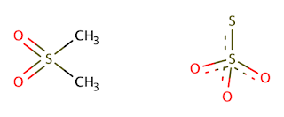
As you can see, there are some similarities in their composition, with a number of oxygen atoms bonding to a central sulphur atom. Even if in MSM the oxygen atoms aren't negatively charged, they still have two free electron pairs that may draw in some of the positively charged silver ions. The effectiveness of MSM without experimental measurement is to be debated however, as even sulphite, or SO32-, which can be considered an intermediate between sulphonyl and thiosulphate, only poorly dissolves Ag+ according to our trusty solubility chart. However, since the MSM is probably present in a large excess and the amount of silver to be diluted is miniscule, it might actually be something that works, albeit not very effectively.
A final suggestion that Principe makes for the fixer recipe is adding potassium bromide, that according to her will speed up the process and 'also dissolve the silver bromide'. The only mechanism by which potassium bromide can react directly with silver bromide is: AgBr + KBr → AgBr + KBr. Clearly this is a pointless tautology, but Principe nevertheless asserts that 'adding 25 grams of potassium bromide to the salt fixer speeds up the process.' If this is experimentally found to be true, then it might do this by reacting with some other molecule that reacts more strongly with bromide and would otherwise hinder the reaction with silver. However, in more general cases, the presence of an excess of bromide will impede any other reaction with the silver in what is known as the common ion effect.

So now we have clearly seen that it can't be NaCl, or KBr, that dissolves the silver bromide, then what might be the mechanism at work here? A suggestion I've found which sounds plausible is that the silver bromide reacts with the small amounts of anti-caking agents present in industrially produced table salt. As these additives are generally larger ligands that usually are able to dissolve metals to some extent, there might be a possibility that the small amounts present in the saturated table salt solution are enough to dissolve some of the silver bromide over the course of a day. However, I'm not fully convinced of this explanation, as the only legal anti-caking agents in the EU are likewise poorly soluble in water when combined with silver. It could be equally as likely that the slow dissolution process Principe observes is simply the time it takes for the miniscule amount of silver to dissolve in pure water. It is unclear, however, whether or not this possibility has been tested or even considered.

In the final chapter, waste management, it once again becomes abundantly clear that Principe understands very little of the chemistry she's working with. She firstly claims that 'because of the organic nature of these chemical alternatives, waste management is easier to handle, which is a non-sequitur, especially if one considers the use of the word organic, as meaning carbon-based, in chemistry. Shortly after she asserts that 'discarding fixer solutions is more difficult due to the traces of silver left in the spent solution'. Her first answer to this problem is electroplating the trace amounts of silver out of solution. This is technically possible, if not very effective, but she completely overlooked a very big problem with this method when applied to her fixer recipe. Principe's fixer recipe is a saturated solution of sodium chloride. Electrolysis of sodium chloride will mostly produce chlorine gas, which was famously used as a chemical weapon during the first world war. So although the tiny amounts of silver might have some environmental impact, electrolysis is definitely not the answer to that particular problem.
In her report Principe never considers the side products of her reactions, which are usually also the waste products. After all, these are the things that aren't part of your desired reaction, but are nevertheless present. Bromide, for example, is never mentioned by her as a waste product, even if halogens are commonly a major consideration in processing laboratory waste.
To come back to the problem of silver waste; an obvious answer is making the silver highly soluble, with, say, thiosulphate. In a 2009 review of the bioaccumulation and toxicity of silver compounds, H.T. Ratte already concluded that 'silver thiosulfate, a highly soluble compound and main component of wastewaters of photoprocessors, has a very low toxicity (e.g., it is 15,000–17,000 times less toxic than silver nitrate). This can be attributed to the silver complexed by thiosulfate, which reduces the bioavailability of free silver ions.'1 So if diluted and refreshed properly, using the commercial fixer is most likely the easiest, best, safest and most environmentally friendly solution. There's really very little reason to be complicating matters much further.

In conclusion, Guilia Principe's 'research' merely posits a single well-known fact from the 1930's. In addition to a number of false or incomplete assertions, the only novel solution she presents cannot work in the way she claims it does and the first method she suggests for handling the waste products produces a deadly gas.
She spent a year and twenty-two thousand euros to come to these conclusions, which were supported by a major institution in the form of the Rijksakademie and were mindlessly regurgitated by another in the form of the Jan van Eyck Academie.
I would like to end on positive note about all this, but considering their lofty claims of expertise I unfortunately can't see it as anything other than an embarrassment for everybody involved.


     References

1.
Ratte, H.T. (1999), Bioaccumulation and toxicity of silver compounds: A review. Environmental Toxicology and Chemistry, 18: 89-108. https://doi.org/10.1002/etc.5620180112